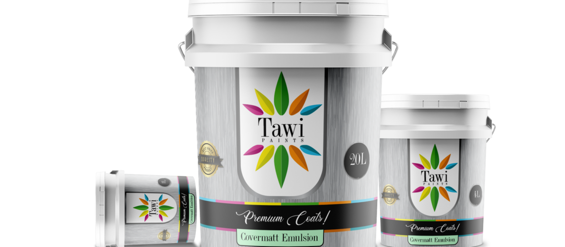
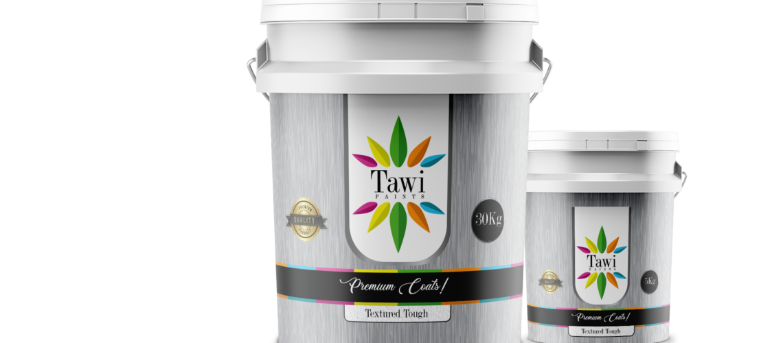
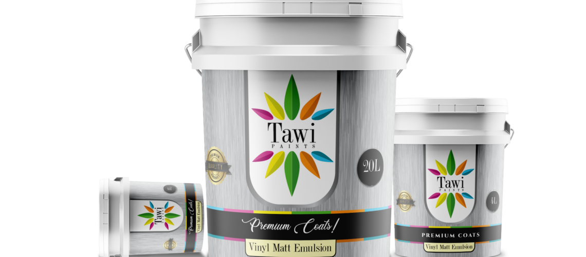
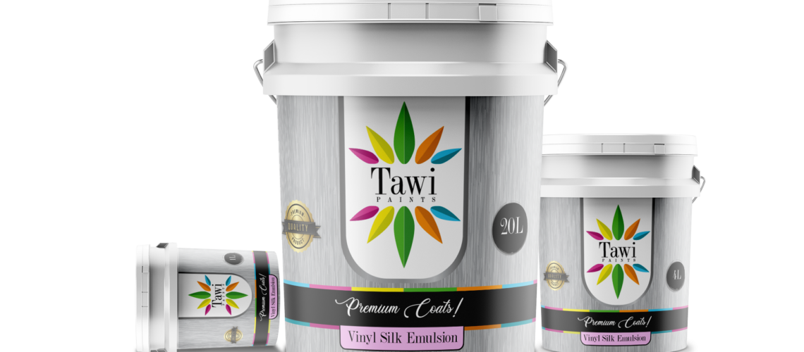
Tawi Paints Package Designs
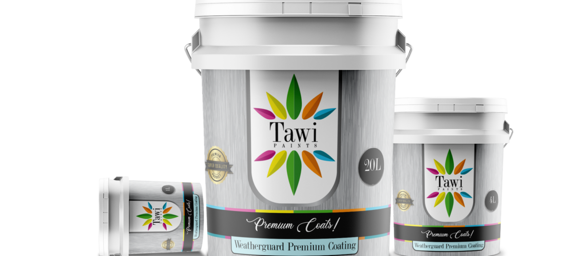
Tawi is a premium paint brand developed under the highest manufacturing standards by Kipepeo Industries — a forward-thinking, environmentally conscious company committed to quality and sustainability. The brief was clear: create a cohesive brand and design system that positions Tawi as a standout premium product in a crowded, price-driven paint market.
Our approach began with strategy. To differentiate Tawi, the brand needed to communicate more than durability and color variety. It had to signal refinement, environmental responsibility, and confidence. The design direction focused on elevating perception — moving away from generic hardware-store aesthetics and toward a cleaner, more contemporary visual identity that feels aspirational and trustworthy.
We developed a unified design language across packaging, marketing materials, and brand touchpoints. This included a structured color hierarchy, premium typography, controlled use of negative space, and a visual system that highlights both performance and eco-conscious credentials. Every element was intentionally designed to reinforce quality — from label layouts to product presentation.
The result is a cohesive brand identity that clearly distinguishes Tawi from competitors. It communicates craftsmanship, innovation, and environmental integrity without overstatement. More importantly, it positions Tawi not just as paint, but as a smart choice for modern consumers who value both aesthetics and responsibility.
This project demonstrates how strategic design can shift perception, strengthen positioning, and create meaningful market differentiation.